The Port of Kalundborg has a new logo and visual identity. It's not just a graphic renewal – it's a visual mark of the development we're in. Based on our local roots and focus on green transition, we've created an expression that matches the port we are today – and the one we will become tomorrow.
A new course – with the roots intact
The new visual identity has been developed with a focus on three things:
1) green transition,
2) digital professionalization and
3) future-proof port operations.
The result is a clear and modern expression that embraces both an international outlook and local roots.
The core of the new identity is our updated logo: an iconic motif that combines the five towers of Vor Frue Kirke with a stylized wave. Together, they tell the story of Kalundborg as both a city and a port – and as a place in motion.
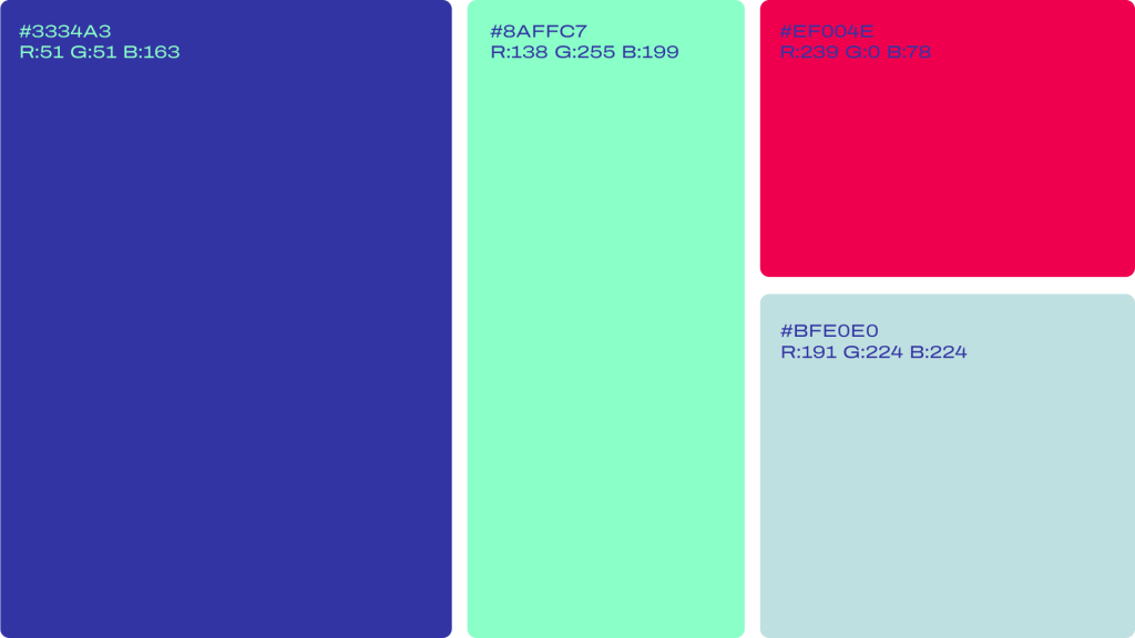
The colors have also been updated: the classic deep sea blue maintains our maritime foundation, while a new neon green tone signals the future and sustainability. The color is inspired by shallow water areas – places where new life arises.
The logo has already been replaced digitally, but during the transition phase you will still be able to see the old logo on cranes and other equipment. It will be replaced on an ongoing basis in connection with service and maintenance.
Our new color palette
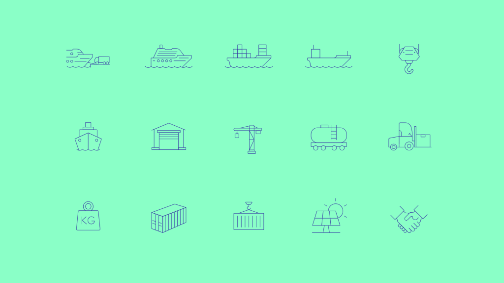
A selection of our icons
Kalundborg Port logo
As a new feature, you can download the Port of Kalundborg's logo package and press photos directly from our website.
You can find the Port of Kalundborg media kit under Press or by clicking here: